Print marketing is still very much alive. In fact, in its new complementary role, it has become more effective.
According to data from Top Media Advertising, ad campaigns are 400% more effective when they use a combination of digital and print strategies. Another article from Financesonline.com states that 82% of consumers trust printed ads more when making purchasing decisions.
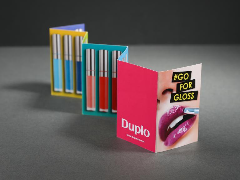
Whether it’s flyers, letters, or packaging[1] , print marketing still works. However, not all printed marketing materials are equal. Some can be more visually appealing and convey clearer messages, while others can be the complete opposite. The difference is in the design.
This article will explore the best practices in designing for print. It will also look into the key differences between digital and print in terms of design considerations.
How to Design for Print
The following are the best practices when designing printed materials[2] , especially for marketing purposes:
Iron Out the Details
There are several details to sort out before you can begin the actual design process. These include choosing your software, aligning with the printer specifications, and triple-checking the page setup.
Create Negative Space
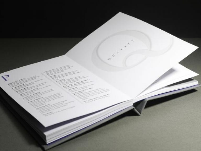
Negative space, also known as blank or white space, is neither bad nor good. It is simply another tool for expression that you can take advantage of when building your design.
Negative space has two main roles in design. First, when used correctly, it allows you to highlight important content on the page by helping build rhythm and structure. Secondly, negative space, like silence in music, allows the viewer a place to rest their eyes between processing important information.
Here are a few of the best practices when it comes to negative space in design:
- Avoid clutter. You keep hearing the adage ‘less is more’ for a reason. Negative space helps keep your design from being too confusing or distracting.
- Distinguish sections. Use negative space to create distance and distinction between elements and sections in your design.
- Highlight content. Instead of thinking of negative space as empty, consider it a tool that will help you showcase the most important bits on the page.
Organise Content
Speaking of content, there is more to highlighting texts than just surrounding it with negative space. Elements have to work together to make sure important information is conveyed. This process starts with organisation.
In organising the content you want on the page, the information hierarchy can serve as your guide. It means you need to rank the design elements according to when you want the viewer to focus on them. Key texts usually come first.
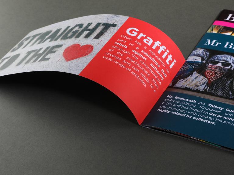
If you’re printing flyers for your new store, for example, you would want your store name, address, and specialisation to be the first texts consumers will see. To achieve this, you can take advantage of design principles like size, contrast, colour, perspective, balance, and patterns. You can lower the opacity of photos and graphics, for example, to make text stand out more.
When working with several pages, you can create a template or ‘master’ page to help make your designs consistent.

Make the Most of Colour
Colour is an exceptional element of design[3] , especially in the way that it can evoke emotion. The ‘less is more’ advice also applies here. Too many colours can cause visual fatigue and confusion.
If your business has a colour theme, you can take advantage of that and incorporate it into your design. Understanding the basics of colour contrast and complementary colours will help you come up with noticeable designs. If you need more inspiration, Adobe has a highly useful resource on this topic.
But mixing and matching colours is only half the battle when designing for print. You also need to consider the colour models used by your chosen application.
You can often get away with using the default colour settings if you’re designing for a website or online pages, but print is a different story. The RGB (red, green, and blue) setting used by most software may not be accurately presented once the item is printed. Instead, printers use the CMYK or cyan, magenta, yellow, and key (black) model. Convert your file from RGB to CMYK before it is exported to achieve the best results.
Clarify the Message
When you’re designing for printed marketing materials, the design usually contains a message. Whether it’s promoting a new product, inviting participants to an event, or simply reminding your target market that your business exists, that message has to be front and centre in your design.
Apart from the elements mentioned in previous sections, typography is an effective principle of design that helps clarify your message. By exploring typefaces, sizes, alignments, and formats, you can create a design where your most important texts are emphasised. This article from Medium provides helpful insights to help you play with typography.
Although visual elements do impact the clarity of your message, a more important consideration would be the message itself. First, you need to make sure that you are only conveying one central message. Follow the objective of your material and stick to it.
Secondly, the message needs to be concise. Too much information, even if they’re all about one central message, can lead to confusion. Whittle down what you want to say for more clarity.
Proofread the Design
One of the most important best practices happens to be the last step before you hand over your design for printing – proofreading. There are a few things more disappointing than having to reprint an entire batch of materials because of one grammar miss or incorrect date.
The saying, ‘measure twice and cut once’ is applicable to print designs. Unlike digital media, you cannot just make adjustments after the fact. Be thorough when going over the design. Triple-check everything. Make sure another pair of eyes go over your design as well. We can be blind to our own mistakes; asking for help can limit this risk.
Whether you’re doing the printing or working with a commercial printer, you must make a sample print. It will help you proofread better and will also ensure that other elements, such as colour, margin, and bleed, are how you envisioned them.
Print vs Digital Design Considerations
There are several key differences between print and digital designs. Understanding these differences will help guide your entire design process:
- Colour – As previously mentioned, colour models differ for print and digital media. The former uses CMYK because the majority of printers use this model. While RGB or HEX colour models from software convert during the printing process, you can achieve better results when the conversion is done beforehand.
- Layout – How designs appear onscreen is different from their printed versions. The positioning of your elements is key since there is only a finite amount of space on paper. Stay on top of the margins, bleeds, and alignments to make sure it turns out well.
- Accessibility – Digital media offers designers more options to create designs more accessible to people with disabilities. These include alt text, screen readers, and closed captions. Depending on your target market, this may be a critical factor.
- Interaction – While they both share the visual quality, digital and print media can also take advantage of incorporating the different senses in the design. Paper, for example, can be scented. Embossed elements can tap into the tactile sensation as well. Keep this in mind when designing.

Conclusion
Focusing on design is important to fully maximise the benefits of print marketing. The success of your printed material will depend on the aspects mentioned in this blog, namely, the presence (or absence) of negative space, how you organise content, how you use colour, and whether your message is clear. Thorough proofreading ensures the best outcome.
If you want to learn more about designing for print or any subject related to printing [4] and printers, feel free to explore the other resources on the website.
You may also get in touch with us by filling out the form on our contact page.


